Sunday, 31 October 2010

DISCRETE MANIFOLD WHATSOVER


Simon Lee Gallery is pleased to present our first solo collaboration with the celebrated artist Angela Bulloch.
“Over the last two decades Angela Bulloch’s work has had many shapes and incorporated most medias in conceptual constellations which probed intersections and opened up hybrid spaces and novel interactions between contemporary visual art’s companions: viewer relations, notions of space, reference systems, and sister disciplines such as architecture, industrial and graphic design as well as music. Lights and switches, simple viewer interactivity, ‘new media’ sculpture and cross references to all kinds of systems and rules have been constant aspects of her work. But in a wider world – where things tend to get boiled-down for easier consumption, it was arguably her numerous ‘pixel box’ installations consisting of different variations and permutations of standardized but infinitely programmable light boxes that zoomed in the digital image and re-visualizing the cinematic, which became something of a signature. 
-

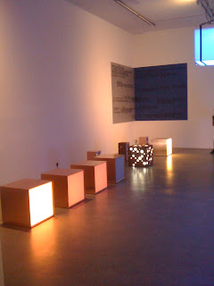
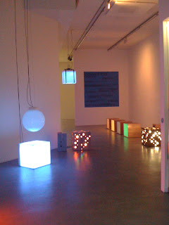
My friend is studying in CSM, I went to the gallery with her in that day. Both of us were enjoy the exhibits very much. You can see there are many lights and sound boxes, they are perfect match!

Friday, 22 October 2010

Typo Typo Typography*


-

There were four sections during the workshop.
At the begining, we needa discuss few of the questions about Typography.
For example:  Do we need to leave a space between each word?
It is obviously YES! For sure, sometime maybe need not to separate when some words are together.
But space is a very important thing between the meaning and appearance.
It depends. If you want to mix a graphic by using words, you no need to give them space, otherwise, you should keep the words clear to present the content and the meaning. That's what i think.

After the discussion, we did the letterform individually. I used letter 'L' to trace it in the different boxes which are provided on the worksheet. You see! I also drew my name on the tracing paper as well -  Lego Yuen. 

Last but not least,  I needa use the worksheet and the boxed provided again to explore the way in which the suggested approaches can express me interpretation and aid meaning.

Finally, I took a long time to finish it since I hope my works are the best. I dont like doing hasty works during the lesson. But honestly, it is better to improve myself that I can do a good job in a short time.

To sum up, Typography was very interesting. And i would very happy if i got enough time to do my work !!!!

Monday, 18 October 2010

Monday, boring day...

Click it for the extention.                            created by Lego Yuen.

My place is very artistic :)

- Kemistry Gallery -


 I very like this Eye ! It's such an icon in this exhibition and dont you think that always catch your focus?
 And also, there are still have some graphic and posters.

 You can see there are so many layers in the poster, and the special thing is it was used in spot color.

 This one, it just used a lot of lines to create a 3D theme. Its also awesome.


I love these two posters very much. I believe they were drawn by using Illustrator.
They are simple but very interesting and cute !!! Especially "Together" !


Actaully I live in Old Street, but I never know there are so many galleries over here !!

Sunday, 17 October 2010

Spray print frog


Saturday was a boring day, goshhhhh. I stayed at home for a whole day.
However, i got something to do - the spray print.
I bought a spray paint and an A1 size paper back from Cass Art.
Then i started to make a decoration in my room.

Firstly, i drew a big frog on the paper.
( i got a tattoo on this frog actually ;)

 Secondly, I cut out the area which should in black on the image.

Then, I sprayed on it.

That is the final of the picture ;)

Lastly, i stuck it on the wall and also sprayed some further dots and spray paint on it to make it more complete.

Friday, 15 October 2010

Image Workshop

There were three parts in that day.
1. Drawing
2. Tracing a leaf
3. Making post cards.
-

For part 1, i was so upsad even wana leave.
Since im not good at drawing, when i saw all of my classmates done a good job.
i felt deeply embarrassed. So im not going to show what i did in this time.
:(
-

In part 2, what was a interesting part! 
we was using a pen to trace 4 different structural relationships from the supplied image of the leaf.


It is my favorite one i did it! I drawed a lot of circles to relate it!

 
I used many straight lines to mix into a shape.


 These are the examples which was given by tutor.

That is my work.

SEE! Those are our final out come.
 ﹣
About Part 3, it is post cards making.
We needa accord nine IMAGE THEME to create post cards.

These words are very useful, they can help me to brain storm my mind. ;)

Here are my funny post cards*

''Humour''

"Surrealism"

"Composition"

"Rhythm" & "Repurposing" & "Juxtaposition"
 -

Collage totally is an interesting skill i like!!